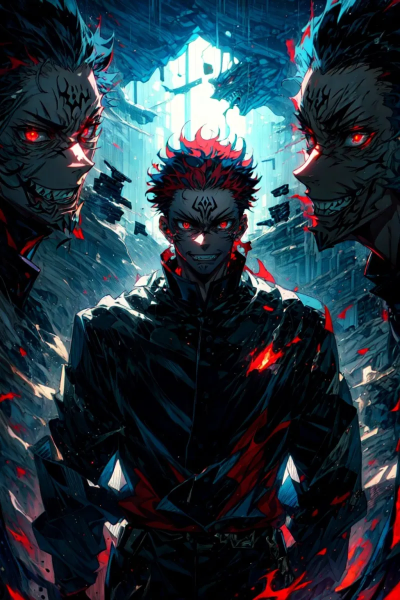
Same Character, Totally Different Vibe: When Anime Redesigns Left Fans Doing a Double Take

Photo by Photo by Logan Voss on Unsplash on Unsplash
Imagine picking up a sequel season of your favorite show, hitting play, and spending the first five minutes genuinely unsure if you're watching the right series. That's the kind of jarring experience anime redesigns can produce — and it happens more often than you'd think. Character designs aren't just aesthetic choices. They're identity. They're the visual shorthand that tells you who someone is before they even open their mouth. So when those designs shift dramatically, fans notice. Sometimes they cheer. Sometimes they riot. And sometimes they do both at once.
Let's dig into what actually drives these transformations, which ones worked, and which ones still have communities divided years later.
Why Designs Change in the First Place
Before we start pointing fingers, it's worth understanding why character designs shift so drastically between productions. The reasons are usually less dramatic than fan theories suggest, but they're still genuinely fascinating.
Studio switches are probably the biggest culprit. When a property moves from one animation house to another, the incoming studio brings its own house style, its own key animators, and its own interpretation of what the source material should look like. No matter how detailed the character sheets from the original run are, something almost always gets lost — or intentionally changed — in translation.
Budget fluctuations play a huge role too. A first season produced on a tight budget might feature simpler, more angular designs that are easier to animate consistently across 24 episodes. If that show blows up and gets a well-funded follow-up, the new team might "upgrade" the look with more detailed linework, softer shading, and complex costuming. To longtime fans, though, "upgraded" can feel like "unrecognizable."
Director and character designer turnover rounds out the big three. A character designer is basically the visual author of a cast. When they leave a project — or when a new director brings in their preferred collaborator — the entire aesthetic DNA of a show can shift overnight.
The Glow-Ups That Actually Worked
Not every redesign is a disaster. Some visual overhauls genuinely improve on the original, and the fanbase comes around after the initial shock wears off.
Take Fruits Basket. The 2001 adaptation had a particular late-90s/early-2000s energy — softer, rounder faces, slightly dated proportions. When TMS Entertainment rebooted the series in 2019 with a complete visual overhaul, some fans of the original were skeptical. But the new designs, with their more refined linework and updated aesthetics, ended up capturing the emotional weight of the manga in ways the first version couldn't quite manage. The redesign wasn't just cosmetic — it felt purposeful, aligned with the story's darker emotional beats. Most of the fandom came around pretty quickly.
Similarly, Hunter x Hunter's 2011 Madhouse remake took character designs from the 1999 Nippon Animation version and sharpened them considerably. Gon and Killua in particular looked more dynamic, more expressive. The shift wasn't universally loved at first — nostalgia is a powerful force — but over time, the 2011 designs became the definitive version for most Western fans who discovered the franchise.
The Redesigns That Started Wars
Then there are the ones that didn't land so smoothly.
Few redesign controversies burned as hot as the backlash surrounding certain visual shifts in long-running shonen properties where character designs evolve mid-series. When a show runs long enough, art drift becomes almost inevitable — early episodes look noticeably different from later ones, and not always in a flattering direction. Fans who came in during peak quality episodes sometimes revisit early episodes and feel like they're watching rough drafts. The reverse happens too: later seasons can look oddly soft or off-model compared to the sharper work that made a series famous.
The Berserk situation deserves its own mention. The 1997 anime had a specific visual identity — gritty, detailed, atmospheric. When the 2016 adaptation arrived with heavy CG integration and a completely different aesthetic approach, the reaction from longtime fans was... not warm. The designs themselves weren't the only issue (the animation style and CG quality drew most of the heat), but the visual departure from what fans associated with Guts and the cast felt like a genuine loss. That conversation is still alive on Reddit threads and Discord servers years later.
The Source Material Gap
Here's something that doesn't get talked about enough: sometimes the "redesign" isn't a redesign at all — it's just the first time a Western audience is seeing the character done differently from what they know.
A lot of American anime fans encounter a franchise through one specific adaptation and treat that version as the original. Then when they discover an older anime, a manga, a game, or a reboot, the visual differences feel like a betrayal of something that was actually just one interpretation among many. Fullmetal Alchemist and Fullmetal Alchemist: Brotherhood are a classic example — both are legitimate adaptations of Hiromu Arakawa's manga, but fans who came up on one version sometimes struggle to fully accept the visual choices of the other, even when the differences are relatively minor.
What Makes a Redesign "Succeed"?
After thinking through all of this, the pattern that emerges is pretty clear: redesigns tend to succeed when they feel intentional and story-driven, and they tend to fail when they feel arbitrary or cost-cutting.
Fans are perceptive. They can usually tell the difference between a visual evolution that reflects genuine creative ambition and one that happened because a new studio just... drew the characters the way their team draws characters. The former generates excitement. The latter generates the kind of forum post that starts with "Am I the only one who thinks..."
There's also a timing element. Redesigns that drop alongside strong storytelling tend to get absorbed into the overall positive reception. Redesigns that land alongside weak narratives become the scapegoat for everything that's wrong with the new production.
The Fandom Memory Problem
One last thing worth acknowledging: fan memory is not always reliable. There's a tendency to remember original designs as more polished than they actually were. Go back and watch the first episode of a show you loved a decade ago and you might be surprised how rough some of those early designs look compared to your mental image of them. Nostalgia applies a filter that no HD remaster can fully compete with.
That doesn't mean every redesign criticism is wrong — some genuinely are downgrades. But it does mean the conversation is almost always more complicated than "old good, new bad."
At the end of the day, character design is one of anime's most powerful storytelling tools. When it changes, it matters. And whether a redesign goes down in history as a glow-up or a disaster usually depends on factors that go way beyond which version hit first.